Logo
The logo is the signature of our identity, and it is important for us to appear as a clear sender in all our communication.
Primary Logo
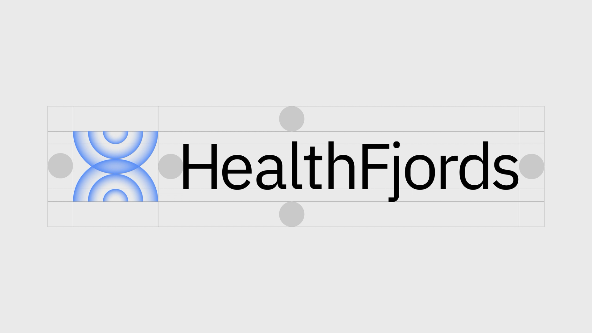
The HealthFjords logo consists of two elements: the symbol and the wordmark. Together, they make up our main logo and should, as a rule, be used together.


Color Usage
It is important to have good contrast between the logo and the background. Below we show examples of color combinations. When used on images, the logo should be blue, black, or white, depending on the color of the background.


For the logo to appear clear and correct, it must always have sufficient space around it. The defined zone ensure that the logo stands alone, without distracting elements or other logos nearby.
No elements may be placed within the defined zone shown here.
Safe Zone
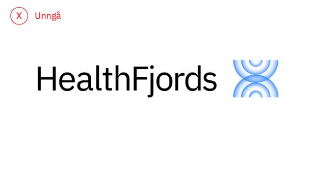
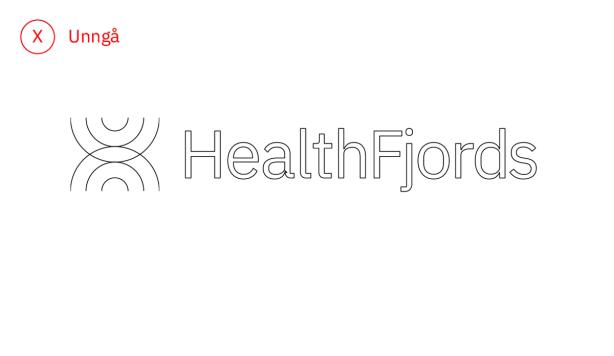
Wrong Use of Logo

Do not change the position of the symbol.
Do not create a stacked version of the primary logo.

Do not rotate the logo.

Do not create an outline version of the logo.

Do not change the size of the symbol in the video.